
Excel makes you the most powerful person - Part 2

Data makes the money go around. Control the data and you influence decisions, and the money. I call this really controlling a company.
When CEO's need information they call their operating office. They ask for e.g. the Revenue, Ebit and Order Entry of a region or country.
The CEO Office contacts the mangers in charge, etc. A whole cascade of panic and fear is initiated.
Plenty of people start searching the information and nobody knows what data exists and who has the information.
I'm a data guy and know the databases and the other data guys. In my world, I call one or two people and get the information within 15 minutes.
Well here you spot the problems of company: permeability. The CEO doesn't know that I exist and I don't know that the CEO needs an information.
But let's go down the road and assume you get such a request. How to handle it with Excel?
I'll show you how to avoid pitfalls in Excel. Once, this is mastered the data is ready to be analysed and this means: ask the right questions and put it into the right diagrams.
Common Pitfalls in Excel
Excel means that data is put into a table. Be sure to have an "Excel table". It means format the data as a table [1]:
- "Select a cell within your data.
- Select Home > Format as Table.
- Choose a style for your table.
- In the Create Table dialog box, set your cell range.
- Mark if your table has headers.
- Select OK."

Sometimes you get error messages, when the data is ill defined. By my experience reason No. 1 are merged cells.
This sometimes needs adjustments. Splitting cells means a new column, new column name and checking the data. The data can be incomplete or in a different format.
A common issue is the format of the date. Numbers like 44159 (serial number), but what we want is November, 24, 2020. Change this via cell formatting (CTRL + F1).
Don't forget the Excel Part 1 Newsletter, where we can prepare the data with the Power Query Editor.
Another common issue is multiple expressions for the same thing, like "N/A", or "NA", or "not available". Harmonise it. Quick 5-second hack:
- Filter all relevant values.
- Correct the first line.
- CTRL + Arrow down (marks all cells in the column)
- Press CTRL + U (The first cell value is written to the marked column)
"Talking to customers in the next week", "Haven't reached the colleagues", or "Some issues occurred". I have seen such fields thousands of times.
Free text fields don't help. Create status like: "Ongoing, pending, closed, In-negotiations, etc." Such fields can be analysed in a Pivot and you gain insights.
The overarching question is always: What kind of information do you need?
It's never the Revenue, Order Entry, etc. Adjust your data accordingly.
Ask the right Data Questions - Know your Business
Trust me when I say the CEO doesn't want the Revenue, Order Entry, or EBIT. (It is the same with any data request, sales numbers, bug reports, tickets...)
Try to investigate why the data is needed. A good approach is the '5-Why-Method.'
Ask 5 times why.
Example:
- Why does the CEO want the Revenue of France?
→ He is concerned about the France site. - Why is he concerned about the France site?
→ He heard rumours about market changes. - Why should the market change?
→ The minimum wage will change. - Why will this affect the business?
→ The EBIT might shrink. - Why does this concern the CEO?
→ Lower EBIT means lower profitability.
BOOM 💥. Here you are. The CEO is asking to see how the business is performing and whether they need to lay off or whether they need other measures.
They want to keep the profitability. This is the core of his questions.
Let's see one more example with sales:
One Manager wants the recent sales numbers.
- Why does the manager want the sales numbers?
→ He wants to see the performance. - Why does he want to see the performance?
→ He is not sure the team is hitting the target. - Why isn't the team hitting the target?
→ They spend less time with customers. - Why do they have less customer-facing time?
→ The CRM System is time-consuming. - Why is the CRM time-consuming?
→ It is not a state-of-the-art CRM.
The manager wants to see where the team is spending their time. Sales people should have 85 % customer facing time. So his question is about the time split.
Whatever data inquiries you get, always ask yourself why people are asking this. This is the moment where you can become the hero.
How to show the data or write the letter? Let's move on to Dashboards and Diagrams.
Dashboards and Diagrams
We have prepared and crunched the data. We see light at the end of the tunnel. How to present it?
Recently, I wrote on LinkedIn to never use a pie chart. Avoid it in 99,9% of cases a pie chart because its use case is rare.
Use a pie chart only when you have 2, max 3 categories where all values SIGNIFICANTLY differ (read at first glance visibly differ).
A bar chart will work out for most cases as in business we compare things, e.g. like countries, months, quarters, years, YTD, MTD, QTD, etc.
The next picture shows a marvellous overview of the possible diagrams.
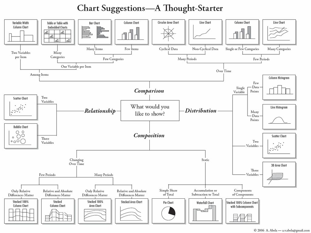
This overview looks nice because it is not crowded. When presenting data, reduce it to 3-5 categories. Nobody can handle more.
When you need more than 5 categories, make a deep dive with another diagram. Imagine 12 months with 5 categories per month. You lose the audience at the beginning.
But how to draw the diagram?
The International Business Communication Standards (IBCS) put together a guide on how to choose colours, layout, and messages etc.
They try to harmonise the way data is presented. It is like with music. Musicians use note and any musician on the planet can read/play it.
Like note for musicians, the IBCS summarizes a universal readable format for data diagrams. Like having the key message in the headline, the dimensions in the top left corner.
Few people know the IBCS, but the pros know it. Stand Out by applying it!
You can read their guide for free on their website - I recommend it!
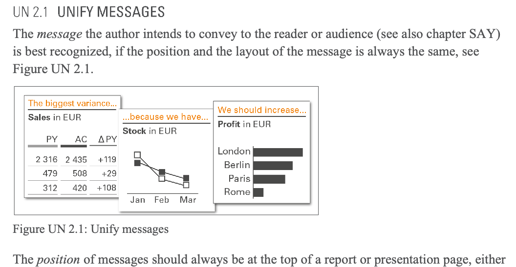
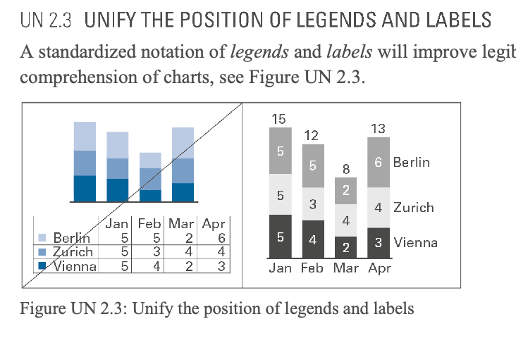
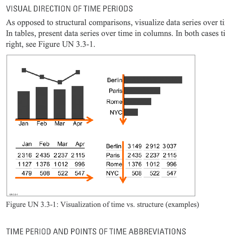
Insights from the International Business Communication Standards, Source: [3]
Dashboards
Putting several diagrams together means we build a dashboard. Here I will keep it nice and short:
Mynda Tracey has built great tutorials on how to build stunning dashboards.
Here are a few examples:
- How To Build Interactive Excel Dashboards
- Power Query and Power Pivot Excel Dashboards
- HR Interactive Excel Dashboard
- Project Management Dashboard
- and many more.
Check out here webpage here or her Youtube video (Interactive Dashboard)
(I'm not an affiliate, just convinced that she is the best Excel coach.)
There is much more to say and to write about data and Excel. I have scratched the surface, hoping to provide you with an overview of the fields needed to stand out.
Summary
The Newsletter Part 1 was about the data preparation with Excel and Power Query, Power Pivot, and VBA. This Part 2 emphasizes getting to know the data and the audience, asking data questions. Always know WHY the data is demanded. Understand and know the business. Once this is all done, present your insights by going beyond the asked questions. Present it in a clean, readable, and unique way. Stand Out with data insight.
Source
[1] https://support.microsoft.com/en-us/office/create-and-format-tables-e81aa349-b006-4f8a-9806-5af9df0ac664
[2] https://flowingdata.com/2009/01/15/flow-chart-shows-you-what-chart-to-use/
[3] https://ibcs.konveio.site/ibcs-standards-12?iframe=true
[4] https://www.myonlinetraininghub.com/workbook-downloads